London: Victoria (and other airports)
Have you heard about London’s new airports? No? Let me explain. Airports are characterised by an assault course of bullying and overpriced shops, a brutal clarity about where a humble pleb can and can’t go, large areas of soulless grey grilles and glazing, silent but conspicuous security and the odd bit of nasty art. Temporary streams of unwilling and bewildered people lurk there, trapped, cajoled, anxious and unrelaxed, trying not to buy things they can’t afford, eating things they don’t really want to eat.
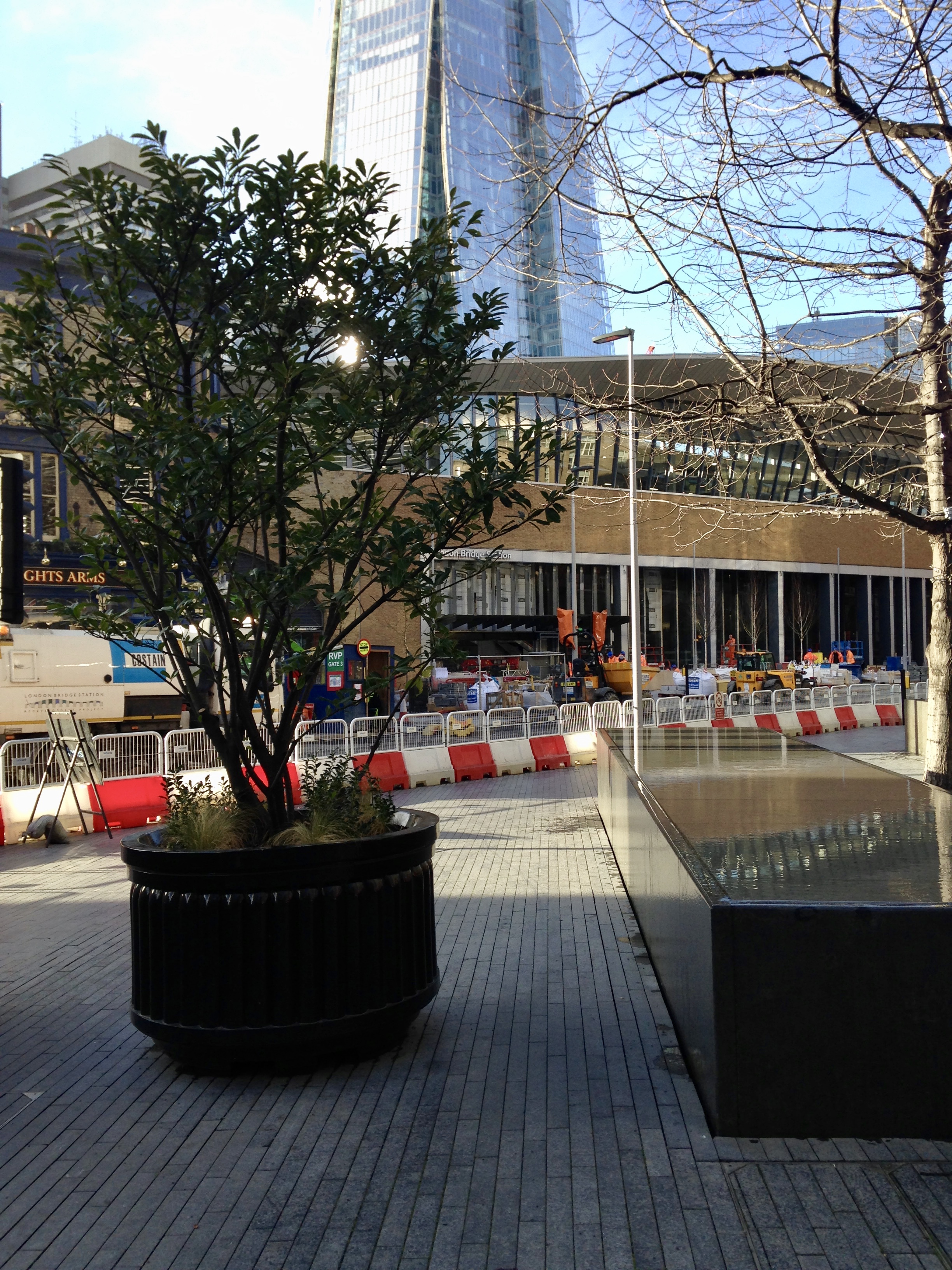
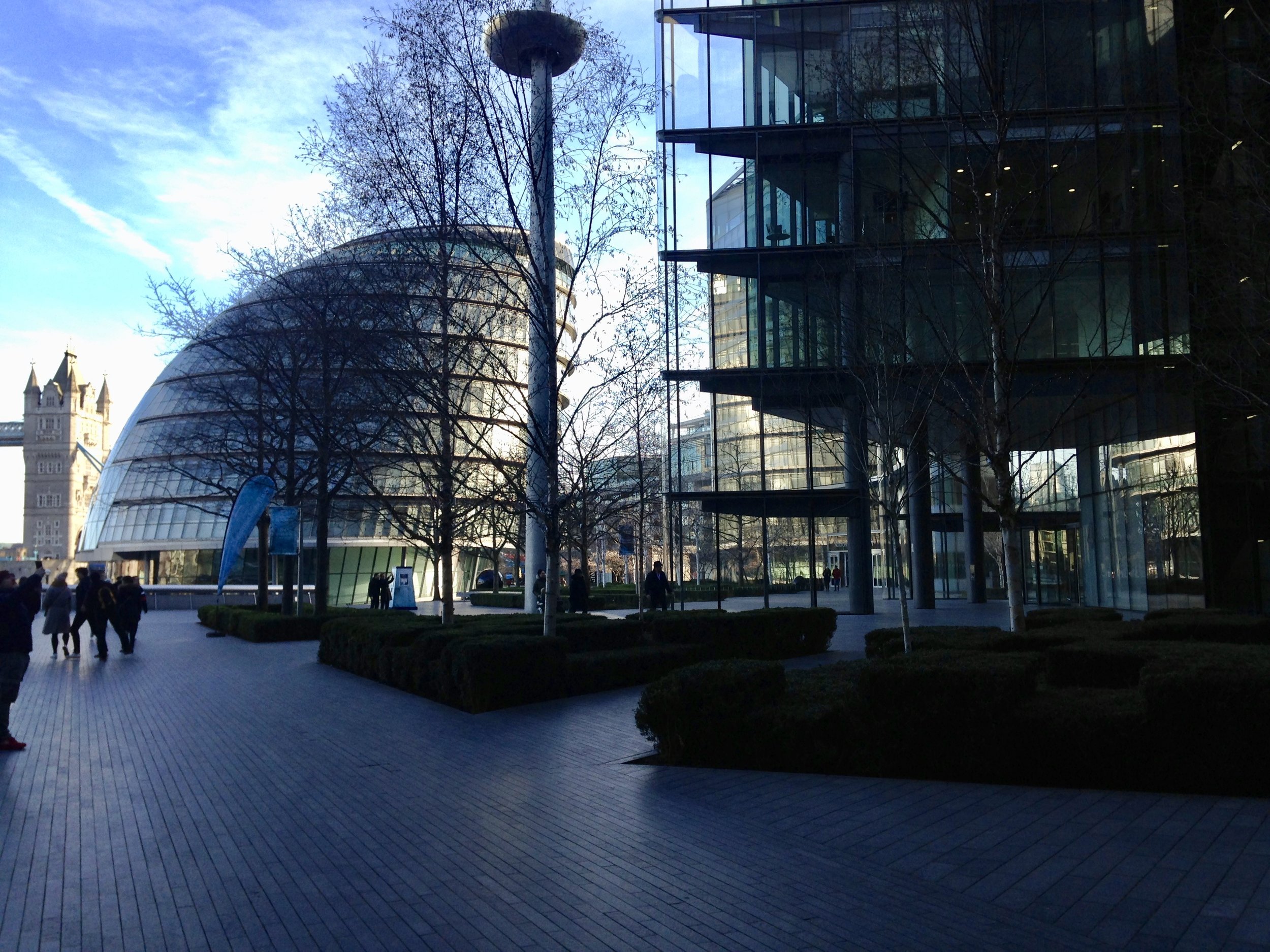
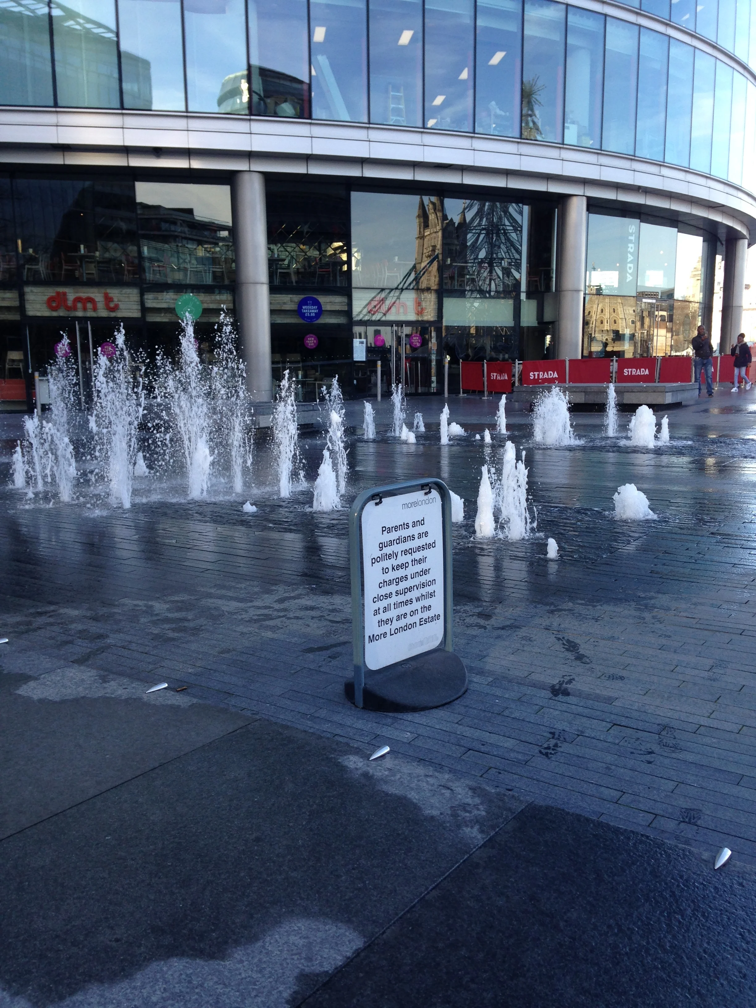
Victoria’s new wind-blown boulevards are the latest manifestation of this airport-inspired ‘place-making’, preceded by More London’s chiselled grey channels, Southwark Street’s new over-puffed body builders and Embassy Quarter’s sulky robots staring at an unfortunate courgette. Before we go further, I’m not averse to density or height – this is no simplistic rallying cry for the one-stop supremacy of the mid-rise street. It’s just that yet again, the hinterland of a major London station has had its soul amputated, and its supine citizenry somehow did not see or sign a consent form.
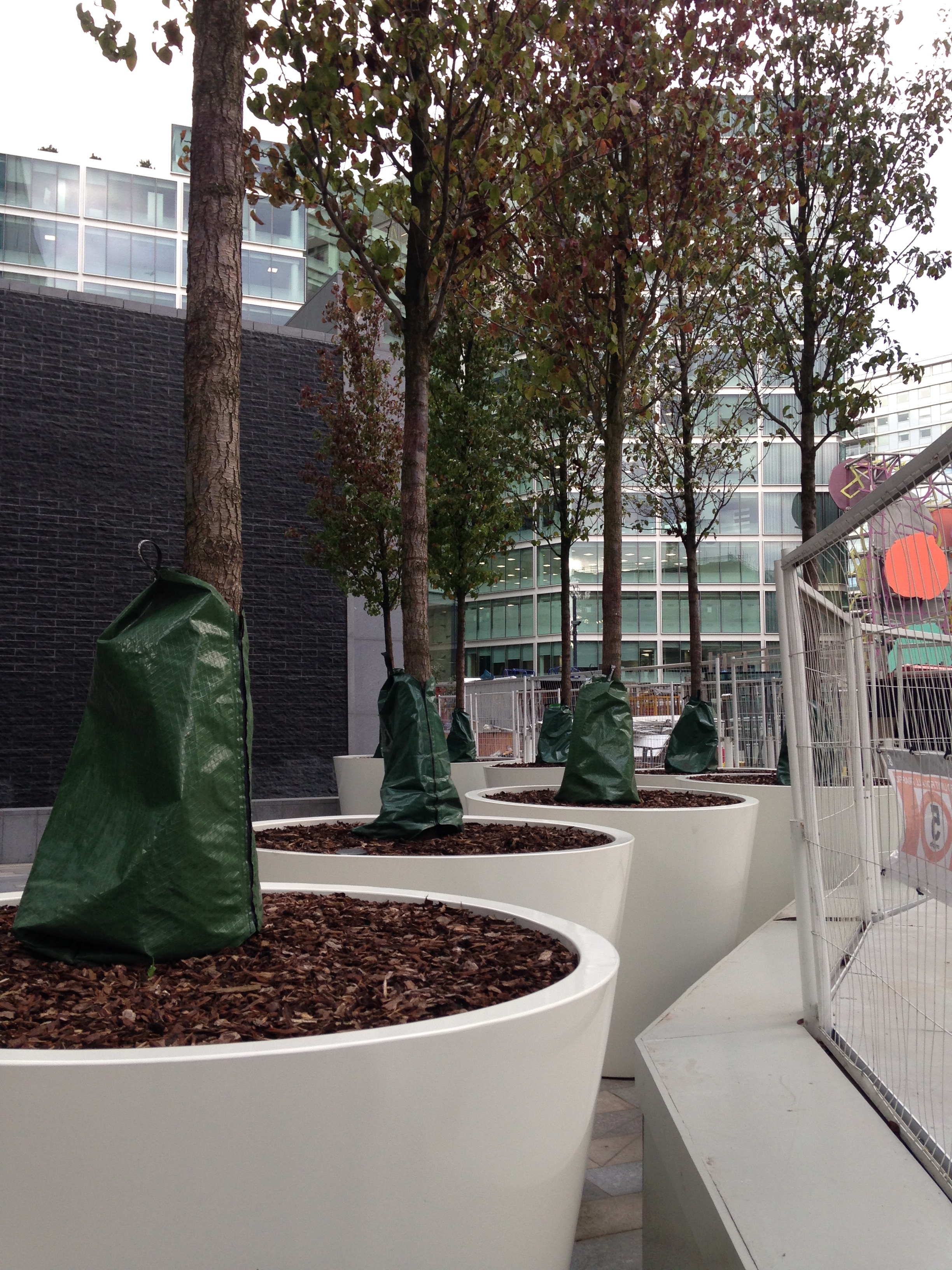
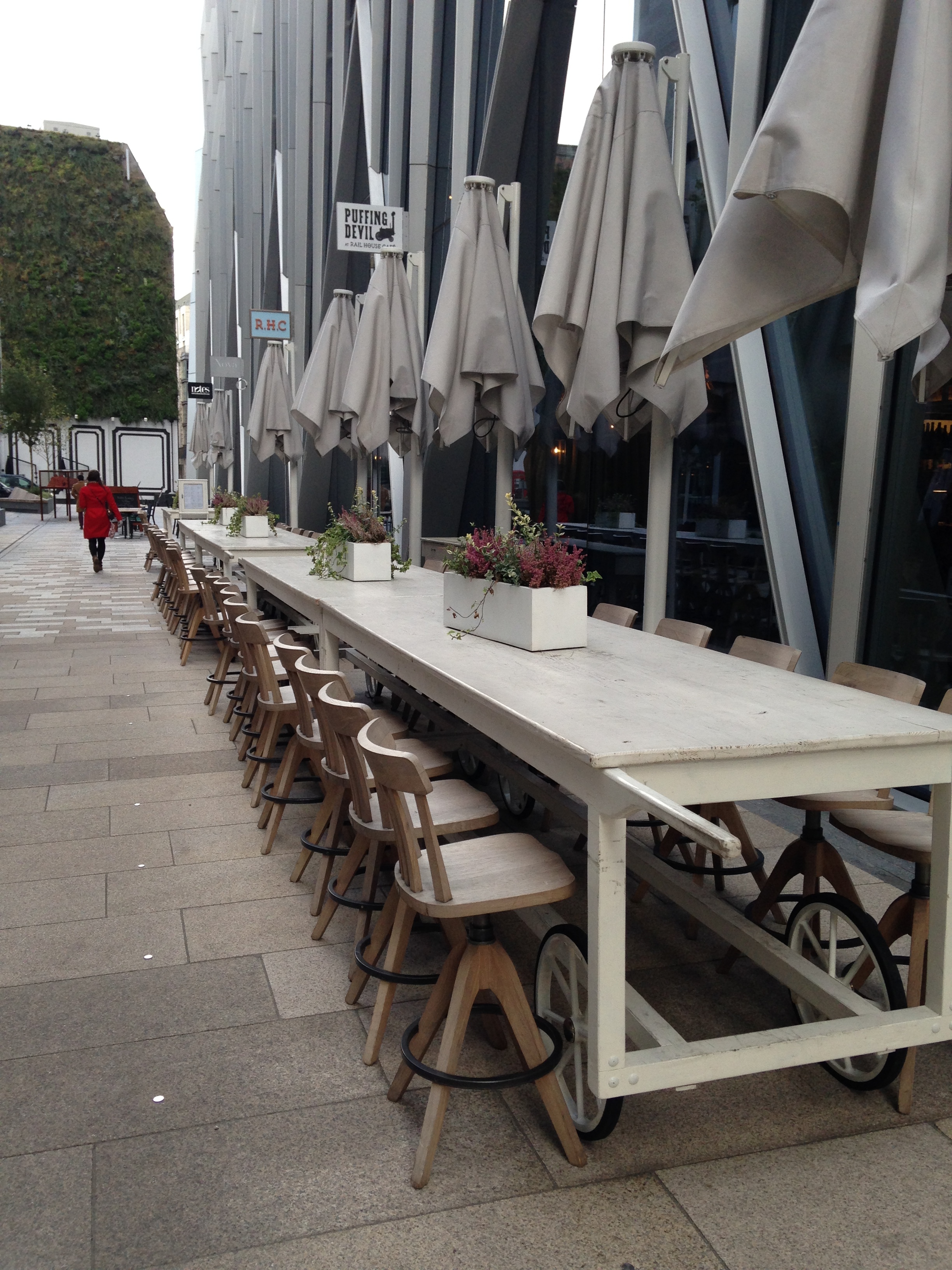
Can I mention the visual clichés? The giant ‘amusing’ plant pots aka security bollards? The ranks of umbrella-ed tables lost in their 12 storey gorges? The splash of ‘living wall’ that says ‘we care’? The over-egged and earnest public art? The blanket of overhead stagey lighting? The slow-paced men in high-vis? The obnoxious signage? The apartments ‘starting at £2.25m’? My cynicism is tempered only by the generosity of pedestrianisation, a welcome new design habit in London’s car-dominated urban realm.
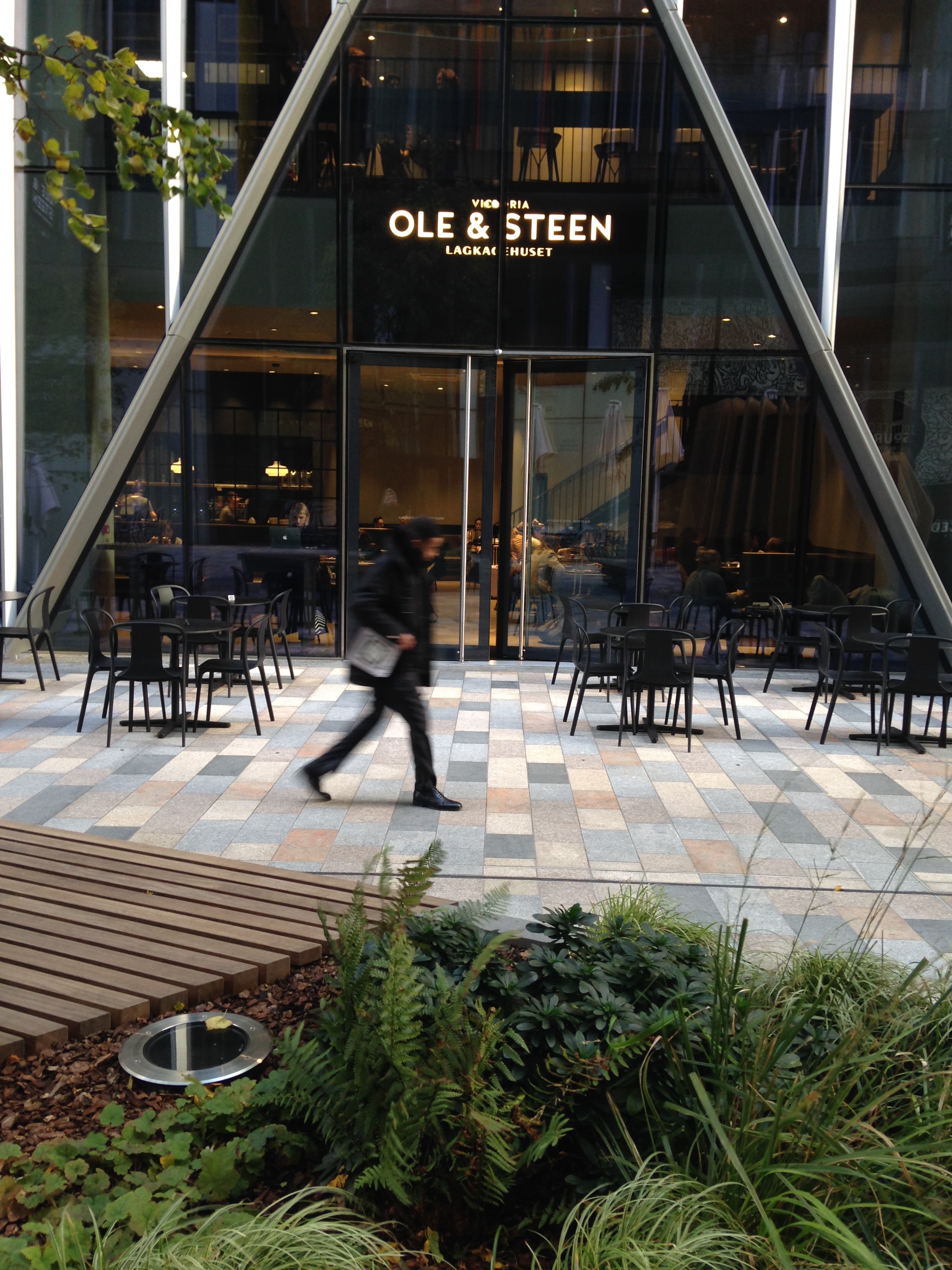
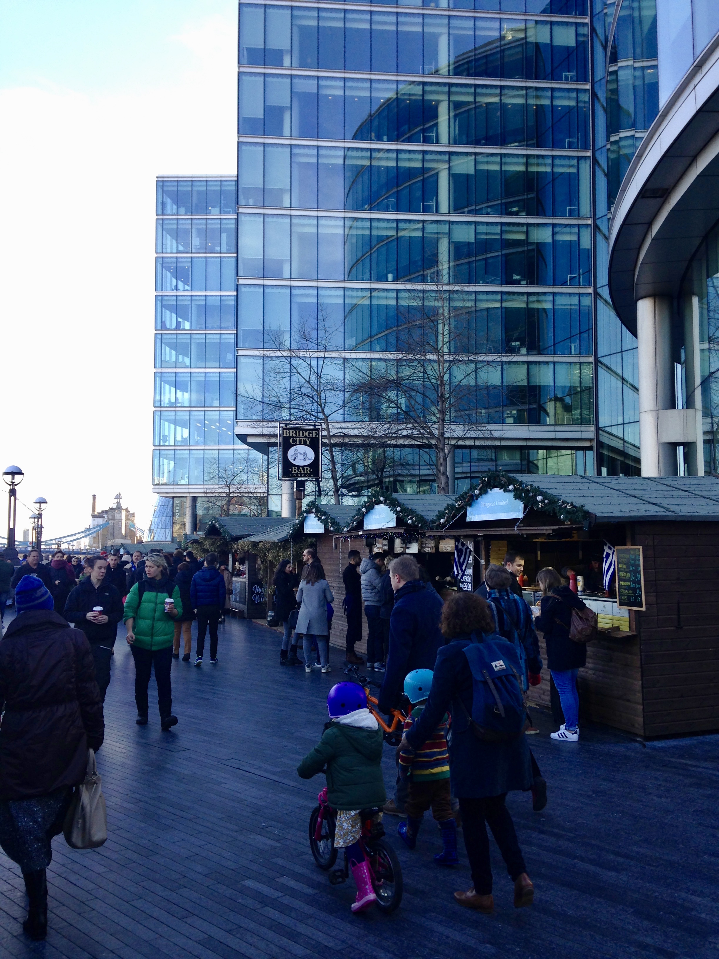
Argent’s painstaking work at King’s Cross shows more sophistication (and is hugely helped by the spectacular existing fabric), but still, for me, suffers from ‘inhospitable ground floor syndrome’. I simply do not hanker for the non-embrace of intimidating triple-height glass-fronted cafés, staffed by not-quite-busy-enough bow-tied and apronned lovelies, serving solitary screen-numbed tourists. No amount of distressed timber worktop, chalkboard signage or artisanal Scandinavian bread will entice me to use my entire body strength to prise open their oversized doors against the wind. (The entrance to Jamie’s Italian and the huts of ‘Christmas by the River’ at More London show how incongruous single-storey timber accretions are needed to generate intimacy.) I don’t believe that humans – even capitalist humans – want to be in these places, eating two course brunches at £21. It’s not that commerce can never conjure delight: the issue is the impoverished ambition and civic meanness of today’s real estate moguls, too busy serving the perceived needs of the jet-set to notice that their newly-minted ‘airport terminals’ are bereft of Londoners.
This stage-set city-making has troubled me before in Hamburg and in France, the latter experiencing its commercialisation on account of new high speed rail links transporting the business elite from one glazed megalith to the next. I am now seeing (through Design Review) an equivalent ‘Crossrail effect’ beginning to take hold in the UK. Developers are seeing the potential in every cowering station along the planned routes – not just the termini – for these cold expressions of hyper-density, dressed up as offers of public space and retail for the grateful urban commuter. Jane Jacobs prescribed mixed use, all day activity, tighter scale, finer grain, a sense of discovery, frequent turnings – in short, intimacy. Is this now impossible as an urban typology? Could someone please try it? I cannot wait for the Design Review where we see a proud developer present a complex labyrinth of alleyways and pocket spaces flanked by a close-packed huddle of mid-rise, variegated buildings. It might not only be viable, but incredibly popular.
