Het Eilandje
Antwerp’s port operation moved north in the 80s, leaving an inevitable ‘sin bin’ behind it and disconnecting the city from its new industrial area. This academic essay tells an interesting story about how Antwerp’s citizens, city government, port authority and the federal government spent decades wrangling over land, pension pots and masterplans. Eventually, there existed both the political will and the role of ‘Stadsbouwmeester’ to make it happen. It’s a role we don’t have in London - a Chief Architect - and maybe we should, though many of the boroughs do now have excellent ‘Directors of Place’. This website is also inspiring: a way for the Flemish federal government to procure design teams, with fees stated! Now why can‘t we do this…? We can folks.
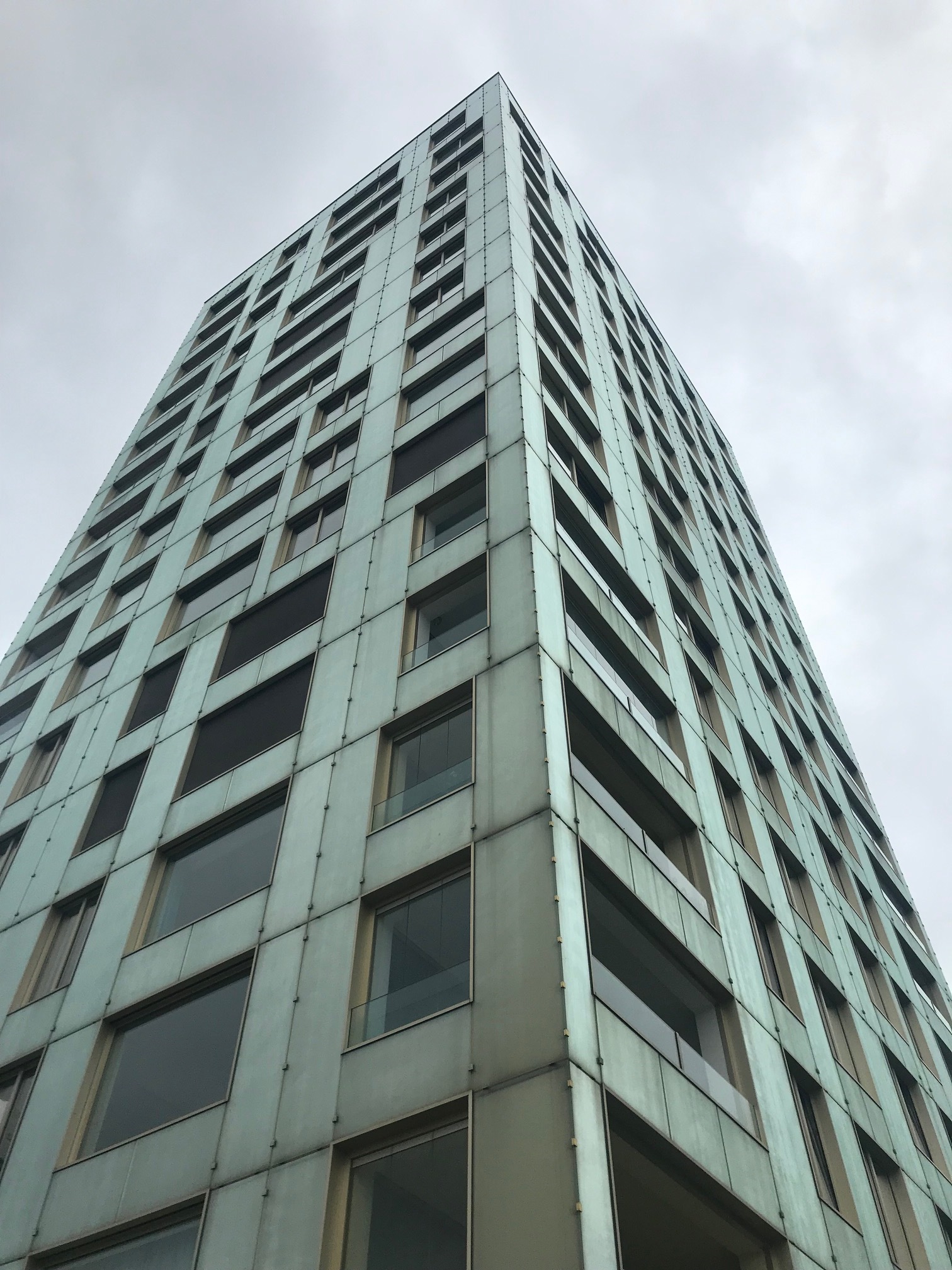
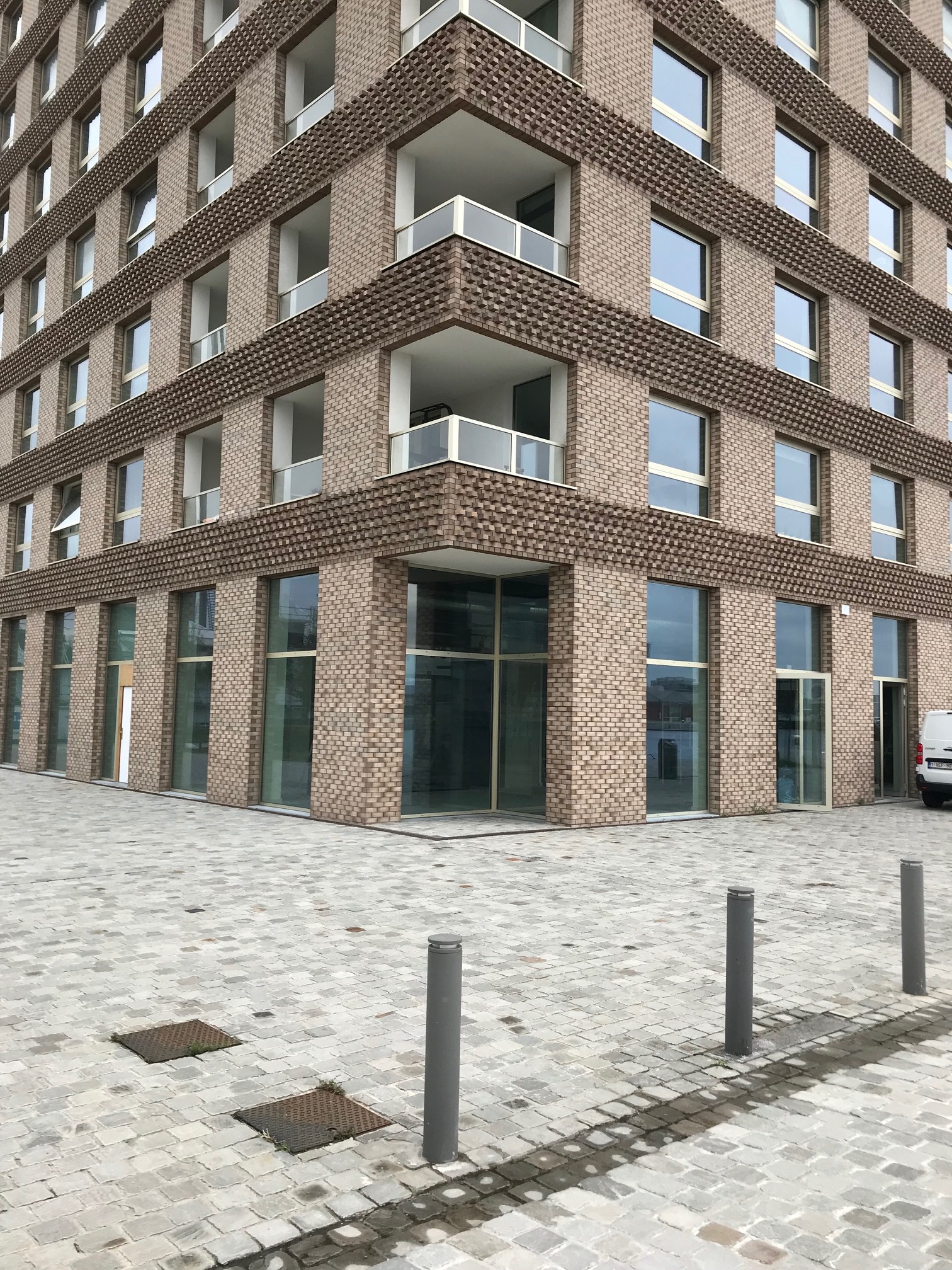
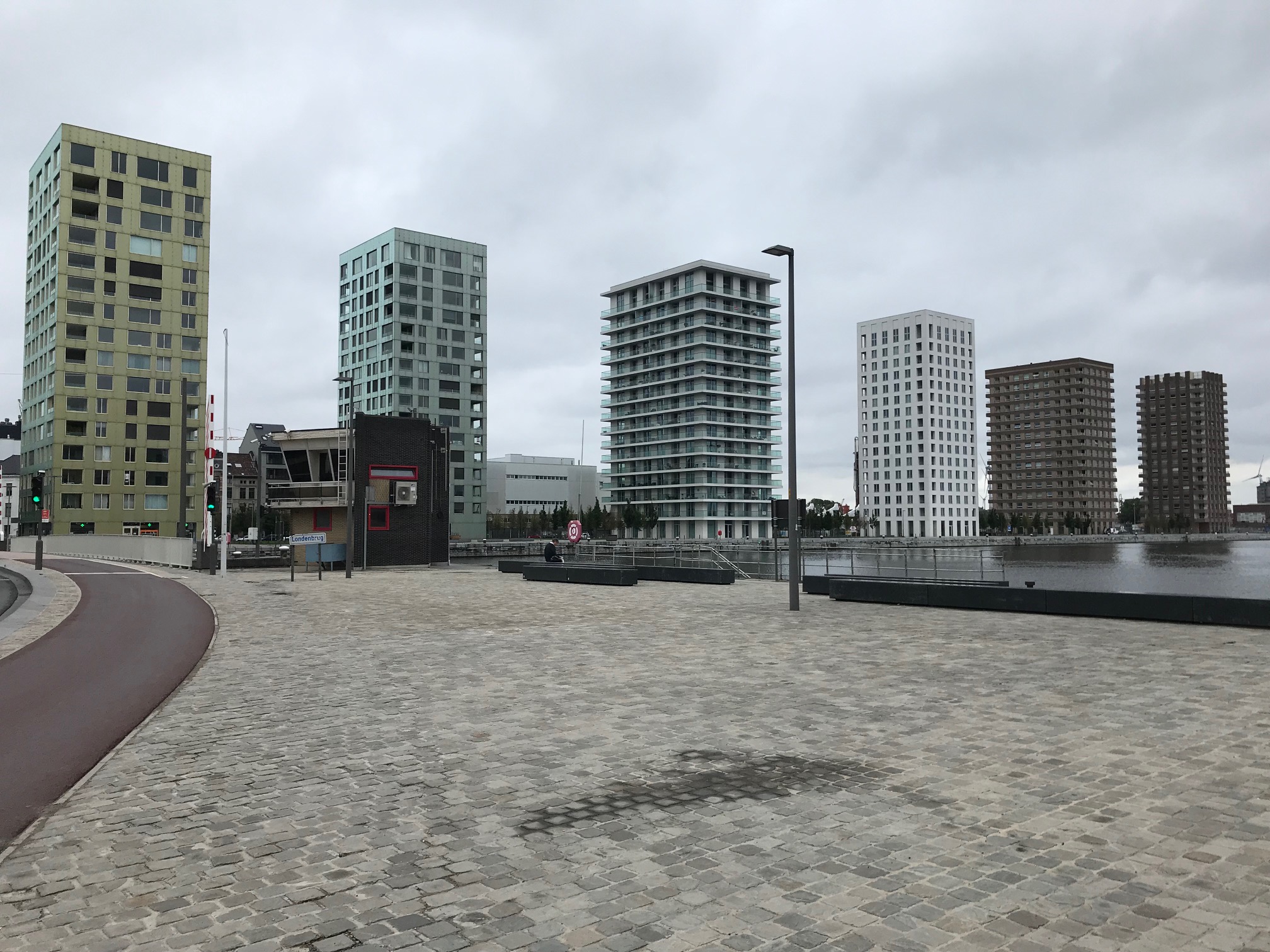
I won’t focus here on the many sheds and vast open spaces which are being repurposed in the ‘Het Eilandje’ area of Antwerp’s old docks. I’ll focus on its new housing, which is a tale of two typologies. The masterplan you can see above looks innocent enough - tight knit, rational perimeter blocks - until you notice the row of little red spots to the west side of the first quay. And therein lies a salutary tale. Six starchitect towers strut their stuff down the quayside catwalk, failing to elicit any enraptured applause from this usually engaged observer. The reason is pretty basic: they did not make a place. The caffs in two of the ground floors could not generate any intimacy. The cladding and fixings on the first two looked (inadvertently I think) very cheap and temporary. The spaces between the blocks were crude, too open, and unlikely to be embraced by their residents. They were all a stumpy 16 storeys. There was nothing to discover, no-one there. A visit to the east side of the basin revealed an alternative vision.
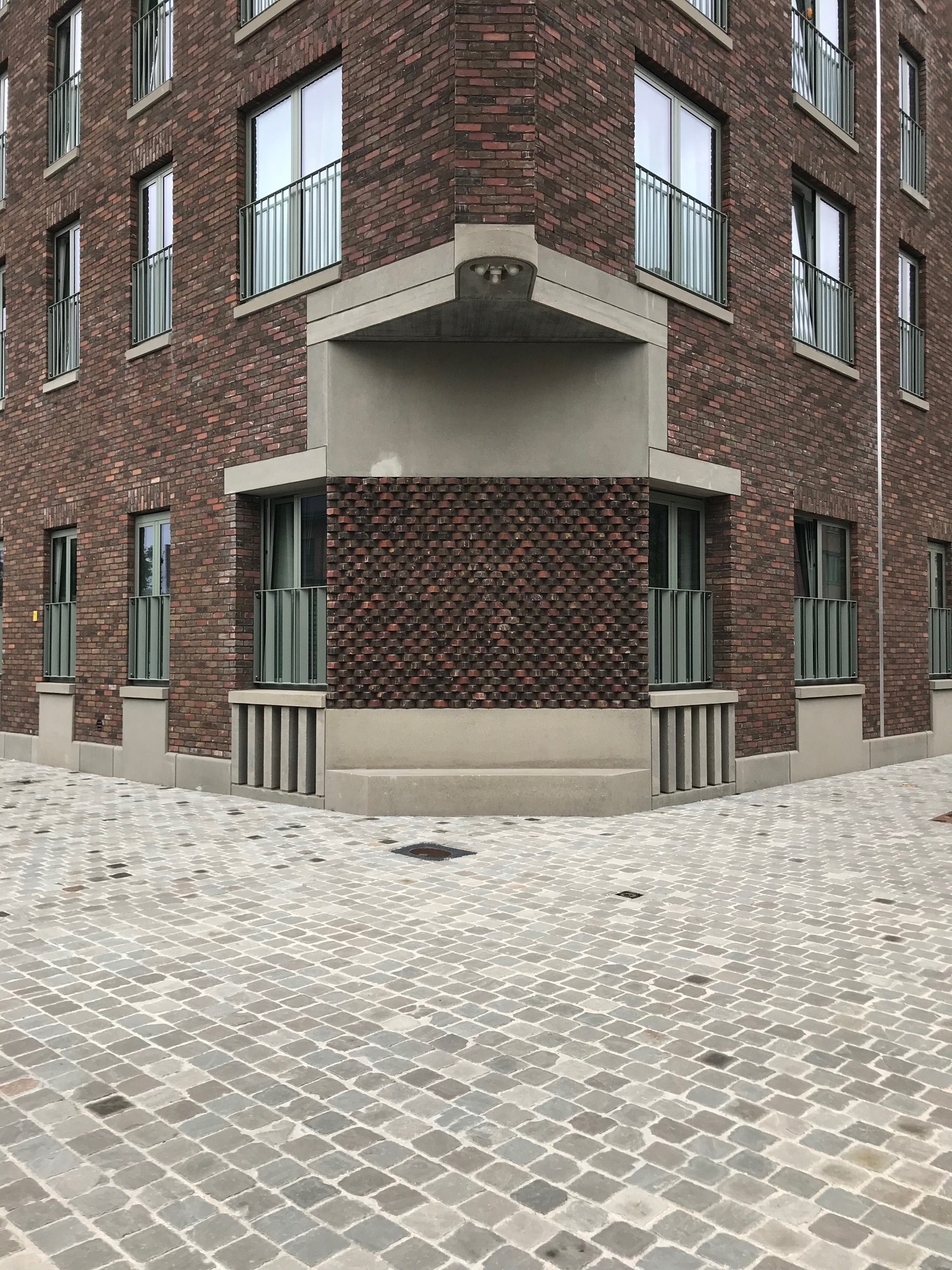
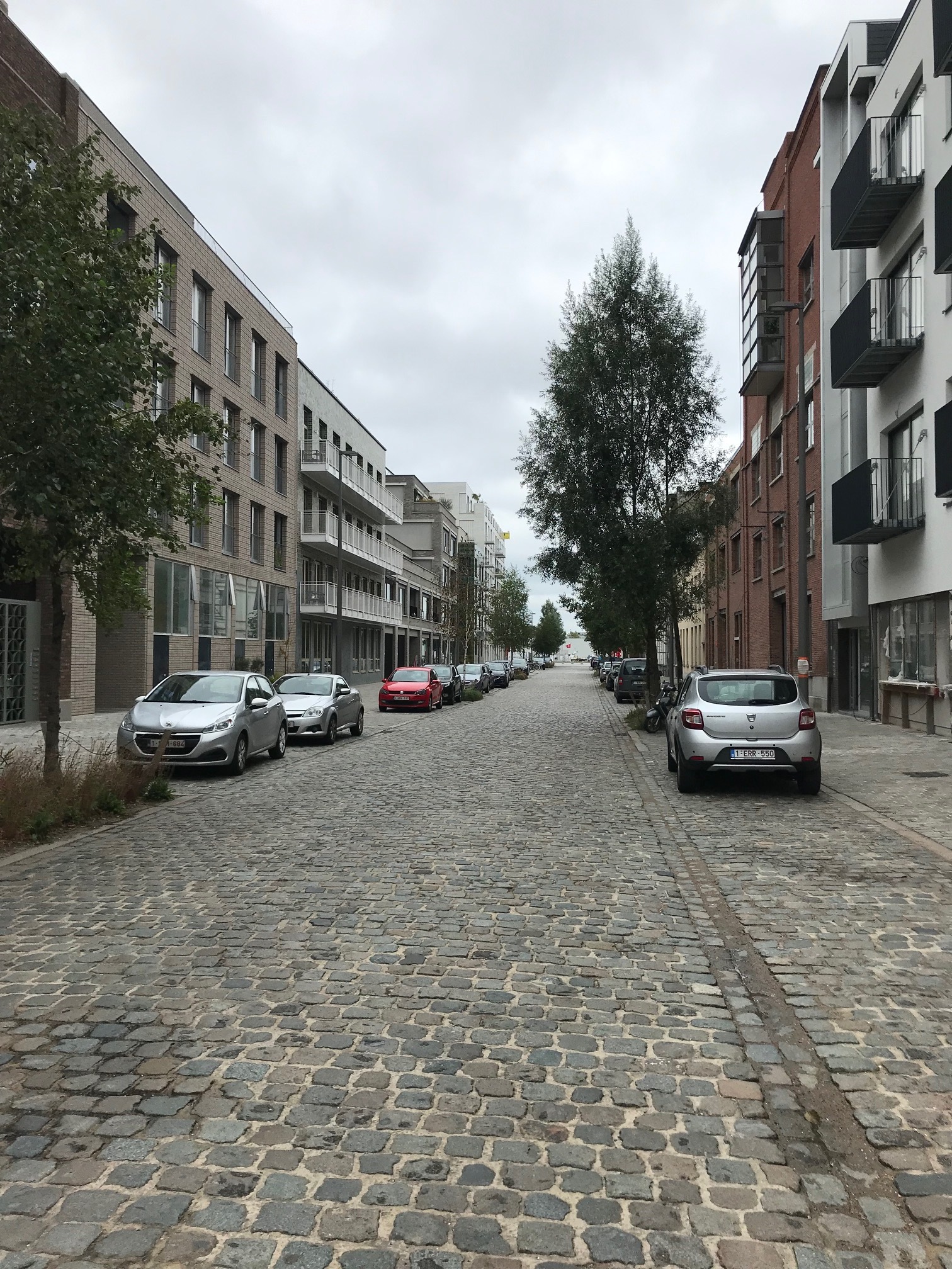
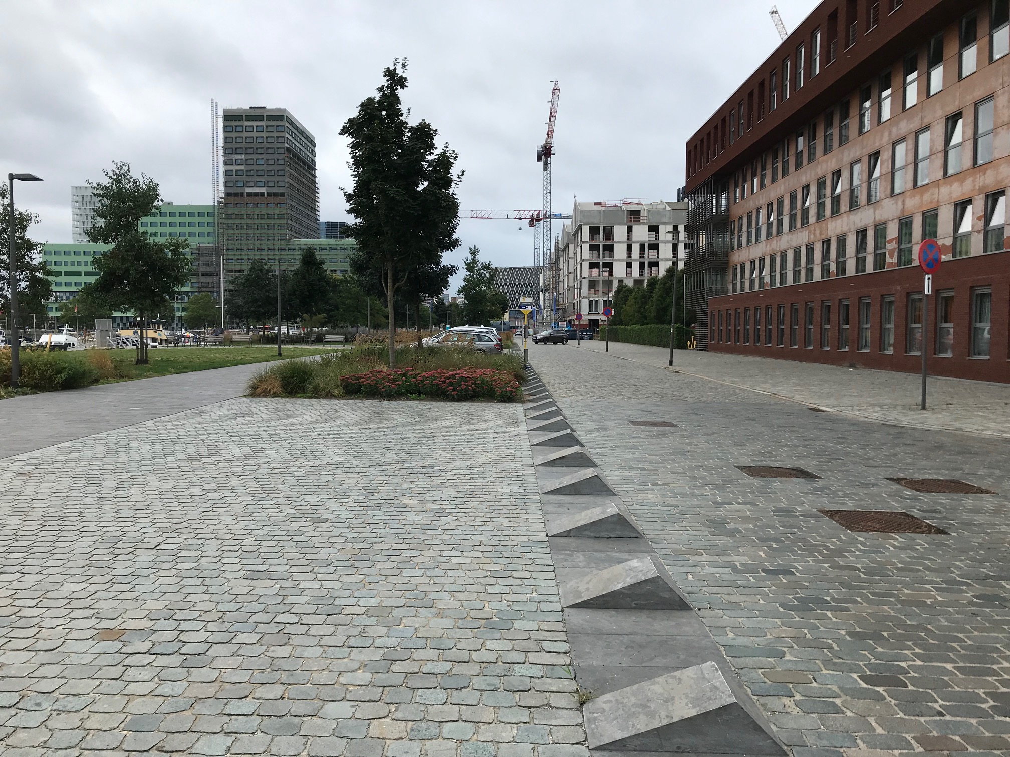
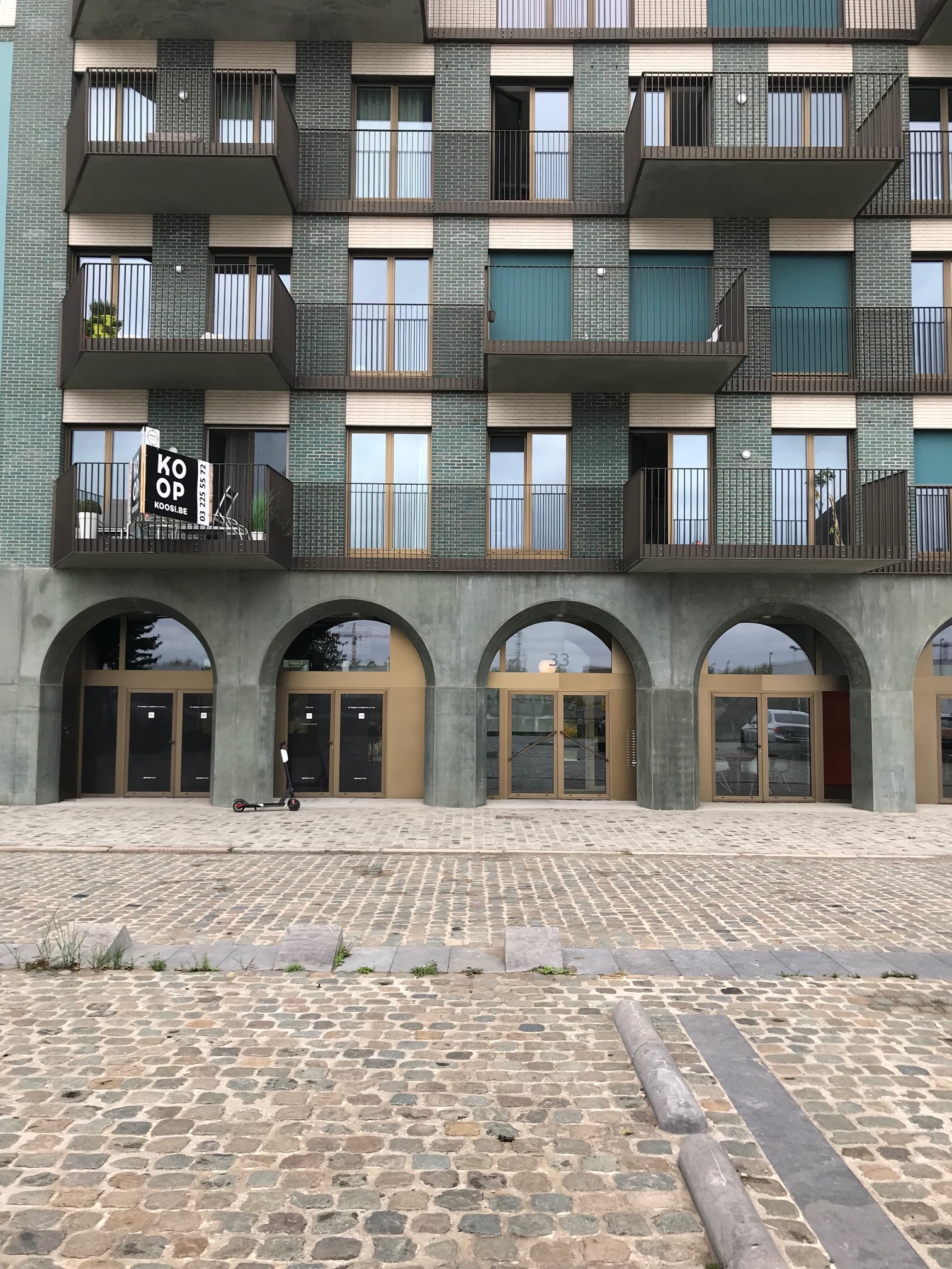
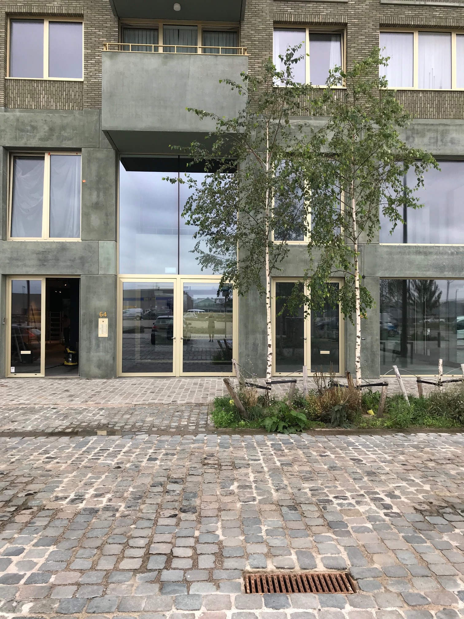
I asked the woman serving me beer and fried sprouts (delicious) across the water in Cadix what she made of the towers. She was surprisingly pro-development and change, but was clear that the new blocks over on the west side ‘are not cosy’. Her brewery and the happy 5-7 storey perimeter blocks embracing it were already comfortable and yes - Mr Scruton - beautiful. One city block clearly had a green colour palette imposed, but with a pleasing variety of interpretations. The term ‘mansion block’ is over-used in the UK to mean any block of flats; my view is that it means ‘a block of flats designed to look like a single home’. And it’s the mansion block which is the chosen typology in Cadix, each designed by different small firms and almost all of them original, careful, and fun in places. Cobbles dominate both the streets (unusually wide - presumably due to existing features) and quayside, causing that rather nice vehicular rumble (as well as some swearing from this cyclist). There were some non-aggressive parking prevention features too, but perhaps not enough tree planting. So what about density?
I’m working with many clients right now to help make sure density creates place. I calculate that the six-fingered limb in Antwerp generates 180 dwellings per hectare with very little other use. The happier blocks across the water appear to be achieved at c. 130 dw/ha, with the addition of multiple other commercial and work-based floorspace. This is no diatribe against height - but it must be done with human beings in mind (and not architectural magazines).
